
Web Development
Boost Your Ecommerce Conversion Rate with Enhanced UX Strategies
Boost Your Ecommerce Conversion Rate with Enhanced UX Strategies using faster pages, clearer flows, stronger trust signals, and testing that removes friction.
S
Shayma Parween
Lead Developer
Jun 21, 2026
10 min read
Boost Your Ecommerce Conversion Rate with Enhanced UX Strategies
Boost Your Ecommerce Conversion Rate with Enhanced UX Strategies by reducing friction at every step of the shopping journey: discovery, evaluation, checkout, and post-purchase reassurance. In practical terms, better UX means faster pages, clearer navigation, stronger trust signals, and a checkout flow that feels predictable on mobile and desktop. The goal is not a prettier storefront; it is a buying experience that helps more visitors complete an order with less hesitation.
Key takeaways
- Conversion rate improvements usually come from removing friction in product discovery, trust, and checkout rather than from one dramatic redesign.
- The highest-impact UX fixes for ecommerce are faster pages, simpler navigation, clearer product information, and fewer checkout steps.
- Good ecommerce UX is measurable through task completion, checkout abandonment, search exits, page speed, and device-specific behavior.
- A useful UX roadmap starts with analytics and user evidence, then prioritizes low-effort fixes before larger design or engineering changes.
- Accessibility, mobile-first design, and transparent costs are not optional polish; they are core conversion drivers for modern ecommerce.
For decision-makers, the real question is not whether UX matters, but where it matters most and what to change first. The best ecommerce teams use analytics, session evidence, and technical performance data to prioritize improvements that are feasible to ship and measurable once live.
Where Conversion Friction Usually Starts
Most ecommerce conversion problems begin long before the cart. If product discovery is confusing, filters are weak, search is poor, or product pages leave key questions unanswered, visitors leave without ever reaching checkout. We often see this in catalogs with too many category levels, inconsistent product naming, or pages that assume customers already understand the product.
A common example is a business selling configurable products, such as industrial equipment, apparel bundles, or consumer electronics. If the product page does not clearly explain compatibility, dimensions, shipping timelines, returns, and pricing logic, the buyer has to leave the page to verify details elsewhere. Every extra tab, search query, or support chat is a conversion leak.
The main friction points to inspect first are:
- Navigation that reflects internal org structure instead of customer intent
- Search results that do not handle synonyms, misspellings, or SKU-based queries well
- Product pages with weak hierarchy, vague copy, or missing answers
- Cart surprises such as shipping, tax, customs, or delivery timing appearing too late
- Mobile layouts that make tapping, scrolling, and form entry unnecessarily hard
The UX Signals That Matter Most to Buyers
Buyers do not convert because a site looks modern; they convert because it feels trustworthy and easy to use. That trust is built through visual clarity, consistent interactions, and enough information to make a low-risk decision. In our experience at eSparks IT Solutions, the strongest ecommerce UX improvements usually come from making the buying path more legible, not more elaborate.
Start with the product page. Use one clear primary action, visible availability status, concise benefit-led copy, and images or video that answer real evaluation questions. If the product requires configuration, show dependencies and price changes immediately. If the buying journey is research-heavy, add comparison tables, technical specs, downloadable documents, and FAQs directly on the page rather than burying them elsewhere.
Trust signals also need to be specific. Generic badges do little; buyers respond better to evidence that reduces perceived risk:
- Transparent return, shipping, and warranty information
- Secure payment and privacy cues near the point of action
- Clear business identity, support hours, and contact options
- Reviews or testimonials that are recent and relevant to the product category
- For B2B ecommerce, account-level pricing logic, invoice options, and purchase order support
Build the Journey Around Mobile-First Behavior
Mobile ecommerce is no longer a side case. Many shoppers browse on mobile first even when they complete the purchase later on desktop, and any awkwardness on a smaller screen tends to magnify drop-off. Mobile-first design is not about shrinking desktop pages; it is about rethinking hierarchy, spacing, input, and speed for touch-based behavior.
The checkout flow deserves special attention. Keep forms short, use address lookup and autocomplete where possible, and break long flows into clearly labeled steps. Guest checkout should be available unless there is a strong business reason to require accounts. For registered users, smart defaults, saved addresses, and tokenized payment methods can meaningfully reduce friction when implemented carefully.
Technically, this is where modern frontend and platform choices matter. Teams often pair performance-minded frameworks such as Next.js, Nuxt, or server-rendered commerce platforms with CDN-backed asset delivery, image optimization, and lazy loading. On the mobile experience side, treat the layout as a set of tasks: find product, verify fit, add to cart, pay, and confirm. Each task should require as few gestures as possible.
Boost Your Ecommerce Conversion Rate with Enhanced UX Strategies
To Boost Your Ecommerce Conversion Rate with Enhanced UX Strategies, use a decision framework that ties UX work to actual buying behavior. The most effective teams do not start with a redesign; they start with evidence from analytics, search logs, heatmaps, session replays, support tickets, and checkout drop-off patterns. That combination reveals whether the problem is discoverability, persuasion, performance, or form friction.
A practical prioritization framework looks like this:
- Diagnose the biggest leaks in the journey using funnel analysis and device segmentation.
- Identify whether the issue is technical, informational, or behavioral.
- Estimate effort versus impact, including design, engineering, QA, content, and legal review.
- Ship the highest-confidence fixes first, then measure before expanding scope.
- Iterate based on what users actually do, not on internal preference.
For example, if mobile users abandon at shipping selection, the issue may be unclear delivery dates, unexpected costs, or a form that is too hard to complete. If visitors exit product pages quickly, the problem may be poor information architecture or weak product content. If traffic is healthy but searches fail, investing in site search relevance may outperform a visual redesign.
Typical project ranges depend on scope and platform complexity. A focused UX audit can often be completed in about 1 to 3 weeks. Targeted improvements such as navigation cleanup, checkout simplification, or template updates may take 2 to 6 weeks. Larger redesigns or commerce replatforming efforts commonly stretch across several months because they involve architecture, content migration, integrations, and QA.
Technology Choices That Support Better UX
The right UX strategy depends on the underlying stack. A strong storefront can still underperform if the CMS, commerce engine, payment gateway, search layer, or personalization tools are poorly integrated. Decision-makers should ask whether the platform supports fast iteration, stable APIs, and performance budgets that the team can actually maintain.
Useful technology components often include:
- Search services such as Algolia, Elasticsearch, or OpenSearch for faster and more relevant product discovery
- Headless or composable commerce architectures when content, catalog, and checkout need to evolve independently
- CDNs and image pipelines for reducing latency across regions like the USA, UK, Canada, Australia, UAE, Saudi Arabia, Qatar, and the Netherlands
- Analytics tools that capture funnel events, scroll behavior, and checkout step completion
- A/B testing or feature flag platforms for controlled experiments
Security and compliance are also UX issues. Payment flows should align with PCI-DSS expectations, and customer data handling should respect applicable privacy rules such as GDPR in Europe and regional data-residency requirements where relevant. Slow or invasive consent flows can hurt conversion, but so can weak trust in how data is handled. The balance is to be transparent without creating unnecessary cognitive load.
Common Mistakes That Quietly Kill Conversion
One of the most common mistakes is designing for internal stakeholders instead of shoppers. Product teams may want more categories, marketing may want more banners, and operations may want more notices, but the shopper wants clarity. When pages become overloaded with competing messages, the primary action loses visibility and confidence drops.
Another recurring issue is treating UX as a visual refresh instead of a cross-functional discipline. If performance, content, search, checkout logic, and analytics are not aligned, a polished interface can still fail. We have also seen teams invest heavily in acquisition while ignoring page speed, which effectively pays for traffic that arrives to a frustrating experience.
Watch for these pitfalls:
- Long forms with unnecessary fields or forced account creation
- Vague error messages that do not explain how to fix the problem
- Product pages that bury shipping, returns, or compatibility details
- Pop-ups or overlays that interrupt shopping at the wrong moment
- Inconsistent design patterns that make the site feel unreliable
The fix is usually not more features. It is fewer distractions, better defaults, and a sharper understanding of what customers need to decide confidently.
How to Turn UX Improvements into a Repeatable Program
A one-time redesign rarely solves conversion issues for long. Ecommerce teams need a repeatable operating model that combines design, engineering, analytics, and product ownership. That means defining conversion goals, setting design standards, and reviewing UX changes as ongoing product work rather than seasonal cleanup.
A strong program usually includes monthly funnel reviews, regular usability testing, and a backlog of improvement ideas ranked by evidence and effort. Lightweight testing can be done with moderated sessions, unmoderated task tests, or session replay analysis. Larger changes should be validated with A/B testing or staged rollouts where traffic and risk are controlled. The point is to keep learning after launch instead of assuming the redesign is finished.
If you are evaluating a software partner, look for one that can work across web/mobile development, cloud, DevOps, data, and security, because ecommerce conversion is rarely just a design problem. It is a systems problem. Teams like eSparks are most useful when they can connect UX decisions to platform performance, backend constraints, and operational realities without forcing the business to choose between speed and quality.
FAQ
What is the fastest way to improve ecommerce conversion rate through UX? The fastest gains usually come from reducing friction in checkout, clarifying shipping and returns, improving mobile forms, and speeding up key pages. These changes directly affect hesitation at the point of purchase and are often easier to deploy than a full redesign.
Should we redesign the whole site or fix specific pages first? In most cases, fix specific high-friction pages first, especially product detail pages, cart, checkout, and top categories. A full redesign is only justified when the underlying information architecture, technology stack, or brand system is too inconsistent to improve incrementally.
How do we know if UX is the real problem and not pricing or product-market fit? If traffic is steady but users drop out at the same journey steps, UX is likely contributing to the problem. If users browse extensively, compare products, and abandon only at checkout, friction, trust, or cost transparency is usually a stronger cause than demand quality alone.
How long do UX improvements usually take to show results? Small improvements can be live in a few weeks, and their effect is often visible in the next reporting cycle. Larger structural changes, such as redesigns or platform changes, may take several months before the impact is stable enough to evaluate properly.
Frequently Asked Questions
What is the fastest way to improve ecommerce conversion rate through UX?
The fastest gains usually come from reducing friction in checkout, clarifying shipping and returns, improving mobile forms, and speeding up key pages. These changes directly affect hesitation at the point of purchase and are often easier to deploy than a full redesign.
Should we redesign the whole site or fix specific pages first?
In most cases, fix specific high-friction pages first, especially product detail pages, cart, checkout, and top categories. A full redesign is only justified when the underlying information architecture, technology stack, or brand system is too inconsistent to improve incrementally.
How do we know if UX is the real problem and not pricing or product-market fit?
If traffic is steady but users drop out at the same journey steps, UX is likely contributing to the problem. If users browse extensively, compare products, and abandon only at checkout, friction, trust, or cost transparency is usually a stronger cause than demand quality alone.
How long do UX improvements usually take to show results?
Small improvements can be live in a few weeks, and their effect is often visible in the next reporting cycle. Larger structural changes, such as redesigns or platform changes, may take several months before the impact is stable enough to evaluate properly.
Work with eSparks IT Solutions
Planning a project around this? We help businesses across the USA, UK, Canada, Australia and the GCC ship it. Explore our Web Development services and portfolio, estimate your project cost, or book a free call.
Related web development services
S
Shayma Parween
Lead Developer
Passionate technology writer and industry expert with years of experience in software development, cloud computing, and digital transformation. Dedicated to sharing insights and helping developers stay ahead of the curve.
Related Topics
Continue Reading
More insights in Web Development

Web Development
Progressive Web Apps for Business: A Practical Guide
Learn when progressive web apps for business make sense, what they cost, key trade-offs, and how to choose the right architecture and partner.
Sep 22, 2026
Read More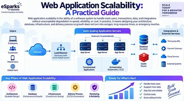
Web Development
Web Application Scalability: A Practical Guide
Learn what web application scalability means, how to design for growth, and which architecture, cloud, data, and DevOps choices matter most.
Sep 21, 2026
Read More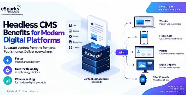
Web Development
Headless CMS Benefits for Modern Digital Platforms
Explore headless CMS benefits for web, mobile and omnichannel delivery, plus costs, pitfalls and a practical decision framework for leaders.
Sep 20, 2026
Read MoreReady to Transform Your Business?
Let's discuss how our expertise can help you achieve your goals